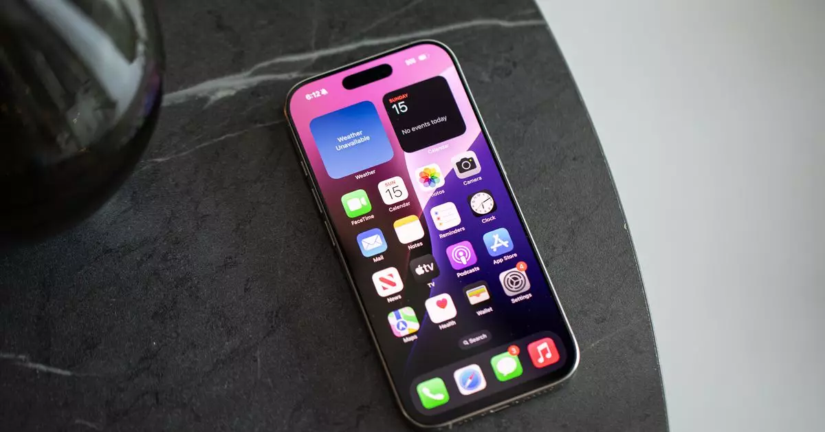
For many smartphone users, the app grid has served as the default landscape of our digital lives, presenting a meticulously organized array of icons. Each app icon is not just a small image; it represents access to essential services, social connections, and sources of entertainment. The grid layout on devices like the iPhone offers a sense of security, organizing our mobile experience in a way that feels manageable. However, as the number of applications continues to proliferate, the once comforting homogeneity can quickly morph into an overwhelming presence that demands unyielding attention.
Initially, managing a modest collection of applications feels straightforward. An organized layout with a handful of folders can easily cater to day-to-day needs. Yet, as we collect more apps, like prized trophies, the grid can appear chaotic. This clutter places a relentless burden on users, distracting from the productivity and enjoyment intended by these tools. This was truly the revelation for many users transitioning to the current versions of mobile operating systems, particularly with the introduction of features designed to revolutionize the grid system.
Recent updates in iOS have begun to challenge the traditional grid layout. With the advent of widgets, an app library, and ‘hiding’ options, users now face the tantalizing possibility of revamping their homescreens altogether. iOS 14 and beyond facilitated a movement that embraced personalization, allowing users to curate their digital experiences. iOS 18 continues this trajectory with increased flexibility. Individuals can not only arrange apps and widgets according to preference but can also breathe life into their screens by selecting colors and customizing actions within the Control Center.
This renovation beckons an exploration into how one can effectively declutter their digital lives. No longer merely filled with app icons, the homescreen can transform into a streamlined interface that better reflects users’ priorities and eliminates distractions. Users like myself have taken on the challenge of reshaping our smartphone experiences and reflecting on what truly belongs on our screens.
Embarking on the journey to reevaluate homescreen organization can feel daunting. It prompts a necessary introspection: which apps genuinely deserve a prime position on the screen? Rather than accepting their locations by default, the act of editing what is on display can lead to greater clarity. During my own exploration, I spent time removing rarely used apps and prioritizing widgets that enhance functionality. For instance, the ubiquity of camera controls and the seamless integration of significant apps led to a reduction of clutter that was surprisingly liberating.
This newfound minimalism is defined by a configuration that prioritizes functionality over mere presence. Organizing apps by usage frequency and utility rather than emotion or loyalty can be revealing. Distancing myself from traditional app icons allowed a unique mental shift; I was surprised to find I did not miss those visual reminders. The reality is simple: most of the time, the desired app appears right at my fingertips within the intelligent suggestions of Siri.
Numerous anecdotes from peers highlight a shared pursuit of a more functional digital experience. Colleagues have expressed their own takes on app organization that largely gravitate toward simplicity. One approach demonstrated an aversion to visual distractions through the use of grayscale icons, which lessened the impulse to delve into time-consuming applications mindlessly. Others maintain a modest presence of icons, opting to use a spotlight feature for quick access.
These revelations underline a pressing truth: with the evolution of personalization, a lesser-spotted yet efficient smartphone lifestyle is accessible. It offers an insightful look into how digital spaces evolve, reflecting a society striving to reduce its reliance on devices without forfeiting convenience.
The transformation of our relationship with smartphones and applications reveals an essential truth about the evolving nature of technology. The traditional app grid is not merely an arrangement of icons; it signifies a deeper understanding of how we interact with technology. As we harness new features and customize our experiences, we can curate our digital lives in ways that minimize distraction and maximize value.
Ultimately, the aim should not just be to find an app, but to cultivate a balanced digital workspace that serves our needs—both personally and professionally. Technology should never feel like an encumbrance but rather an enabler of our lives. Striving for simplicity, we have the power to redesign how we experience the digital world while fostering a healthier relationship with the devices that occupy our daily existence.

