
Apple has always prided itself on innovation, and its latest endeavor—the introduction of Liquid Glass with iOS 26—strikes a bold visual chord that cannot be ignored. Announced during the WWDC 2025, the Liquid Glass design language is intended to imbue its devices with a fresh, modern aesthetic. But while the allure of this new style dazzles the eye, deeper examination reveals challenges that may hinder the user experience.
First Impressions: The Gleaming Surface
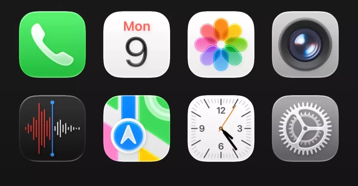
The initial encounter with Liquid Glass invites intrigue. Upon scrolling and tapping through the interface, it’s hard not to be captivated by its shiny, almost ethereal quality. The app icons and control elements seem to float, creating a sense of depth that melds elegantly against the device’s wallpaper. This innovative transparency is not merely a cosmetic flourish; it aims to signal context—the idea that users are able to see layers of information at a glance. Yet, the bright and glossy interface often muddles clarity. In the realm of usability, flashy design can sometimes steal the spotlight, leaving functionality in the shadows.
Familiar Yet Foreign
What truly stands out when transitioning to iOS 26 is the paradox of familiarity mixed with a sense of the foreign. Regular users of previous iOS versions, who recognize the iconic designs of apps, will find it disconcerting as they navigate this reimagined environment. The transformation is jarring, even in cases where icons remain recognizable. Over time, users are likely to adjust, much like how one becomes accustomed to a new layout after a home renovation. However, the observation that something feels ‘off’ may linger longer than anticipated, particularly when multitasking with different apps that reflect varying degrees of glassiness.
Interface Clutter: The Control Center Conundrum
One of the clearest illustrations of design misinterpretation lies within the Control Center—a feature that should ideally promote efficiency but now seems disorganized. With the transparent layers introduced by Liquid Glass, icons appear congested, merging into an amorphous design that can strain a user’s capacity to extract immediate information. Currently, it presents a challenge to find key functionalities quickly, which is counterproductive to the sleekness the aesthetic aims to create. For a platform known for its user-centric design, these major usability hiccups require immediate attention.
Inconsistent Visual Execution
Diving deeper into the intricacies of iOS 26 reveals yet more inconsistencies. From the keyboard design to tab interactions within various applications, there’s a sense that Liquid Glass hasn’t been fully realized. For example, the rounding of elements and animations may feel trendy and dynamic, but when abstracted too far from initial functions, they risk diverting focus from their usability. The gap between design intention and execution is too wide. The spacing in the Settings app—the unnecessarily elongated categories—will challenge even the most patient users. Each of these inadequacies, though subtle, accumulate to form a tangible hurdle to seamless navigation.
Adjusting Expectations and Anticipations
A wave of ambivalence is likely to wash over early adopters of iOS 26. Initially met with skepticism and unease, familiar interfaces that users have relied upon for productivity now seem mystifyingly different. Yet, there’s an undeniable charm in subtle adjustments that redefine the experience, suggesting that adaptation is possible. Developers at Apple will certainly take note of customer feedback, and revisions may narrow the gap between tantalizing design and practical usability before the official launch this fall.
The journey of acclimatization to Liquid Glass mirrors a transitional phase—one that must reckon with both emotional attachment and innovation-driven curiosity. Users long for Apple’s legendary attention to detail; they now await an experience that does justice to its promising initial reveal. Balancing aesthetic evolution and user functionality lies in the hands of its creators, making the forthcoming adjustments crucial for carving the ideal experience in the dynamic landscape of mobile technology.